Uber Design Internship
AI Icon Request Automation
This summer, I worked as a Product Design Intern on Uber’s Base design system team, where I designed an AI-powered tool to streamline the icon request process.
Product teams at Uber often need new icons, but their requests are frequently vague or incomplete, leading to weeks of back-and-forth clarification with the Base team. My project aimed to solve this by introducing AI into the workflow, guiding requesters to provide better inputs, generating structured briefs, surfacing related icons for consistency, and even producing concept directions.
Over 6 weeks, I owned the end-to-end design process: mapping the workflow, defining guided inputs, designing the AI workspace, and running user testing. I partnered closely with a design engineer to shape the AI prompts and build a coded prototype that’s now being developed for internal use.
Duration
6 weeks, Summer 2025
Team
1 designer (me)
1 design engineer
Skills
Product Thinking
Interaction Design
Prototyping
Prompt Engineering
Figma
Tools


The Challenge
The Icon Request Process at Uber was Slow and Inefficient
At Uber, product teams frequently request new icons to support their features. These requests flow into the Base team, which owns and maintains Uber’s icon system. However, the existing request process through an Asana form often broke down:
❌ Vague requests required multiple rounds of clarification
❌ Aligning on icon metaphors sometimes stretched into weeks
❌ Base team spent more time aligning than designing
Why it Matters
Clarity in requests reduces back-and-forth, speeds up alignment, and helps product teams ship faster, all while ensuring a more consistent and positive experience across Uber’s design system.


Solution Overview
A tool that leverages AI to help teams write clearer icon requests, surface visual references, and reduce misalignment.

High-level diagram
Process

1. Research & Problem Framing
I began by looking at past icon requests submitted in Asana and speaking with both requesters (PMs, designers from product teams) and the Base designers who fulfilled them.
Key Insights
Many requests were either too vague or overly long (e.g., attaching an entire PRD)
Some requests were unnecessary — an existing Base icon could have already met the need
The biggest delays came from aligning on metaphors (what the icon should represent), which could stretch into weeks
To broaden possibilities, I also audited external text-to-image tools to understand how AI could support the request process
2. UX Flow
I mapped the end-to-end request flow and explored different ways the tool could guide inputs and generate visuals. Early on, I tested two main directions for each.
For how requests are submitted:
Chat-based flow — open-ended prompts like ChatGPT, flexible but inconsistent and harder to capture required detail
Form-based flow — structured questions (less freedom), ensures completeness and consistency
I chose to have AI generate concept directions rather than production-ready icons. From a design perspective, concepts work better as alignment tools: they spark conversation around metaphors without replacing a designer’s role in crafting system-compliant icons. From a technical side, after discussing with the design engineer, we confirmed that current AI models couldn’t reliably produce icons at the consistency and quality Base requires, making concept generation the more feasible and valuable approach.
For how AI generates visuals:
Production-ready icons — create polished outputs, but requires extra steps for requesters to refine and adjust results
Concept metaphors — produces quicker directions with less control, serving more as inspiration than final outputs
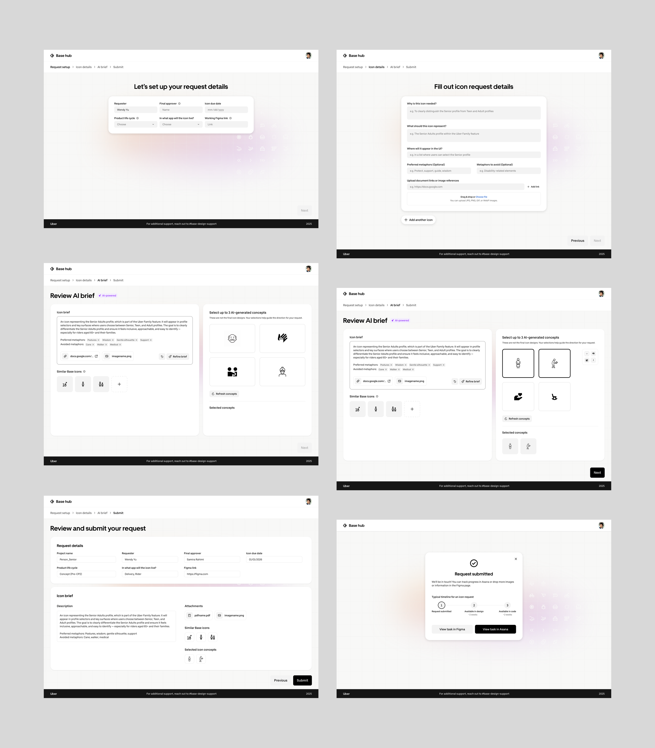
3. Design & Prototyping
I translated the mapped flows into Figma prototypes and iterated from low-fidelity sketches to polished high-fidelity designs, validating the experience along the way.
4. User Testing & Collaboration
To validate the flow and ensure the tool worked for real needs, I ran 3 user testing sessions with designers who had submitted icon requests before.
Key Insights
Some section titles and inputs were confusing → needed stronger content design or added tooltips for clarity.
AI-generated outputs were useful, but users wanted explicit labels so it was clear these came from AI.
They felt disoriented by the number of pages, unsure where they were in the process or how much was left.
I partnered with a design engineer to create a code prototype to simulate AI behavior inside the tool. I also collaborated on prompt engineering to ensure user inputs can lead to AI outputs that were relevant and actionable.
Key Design Decisions
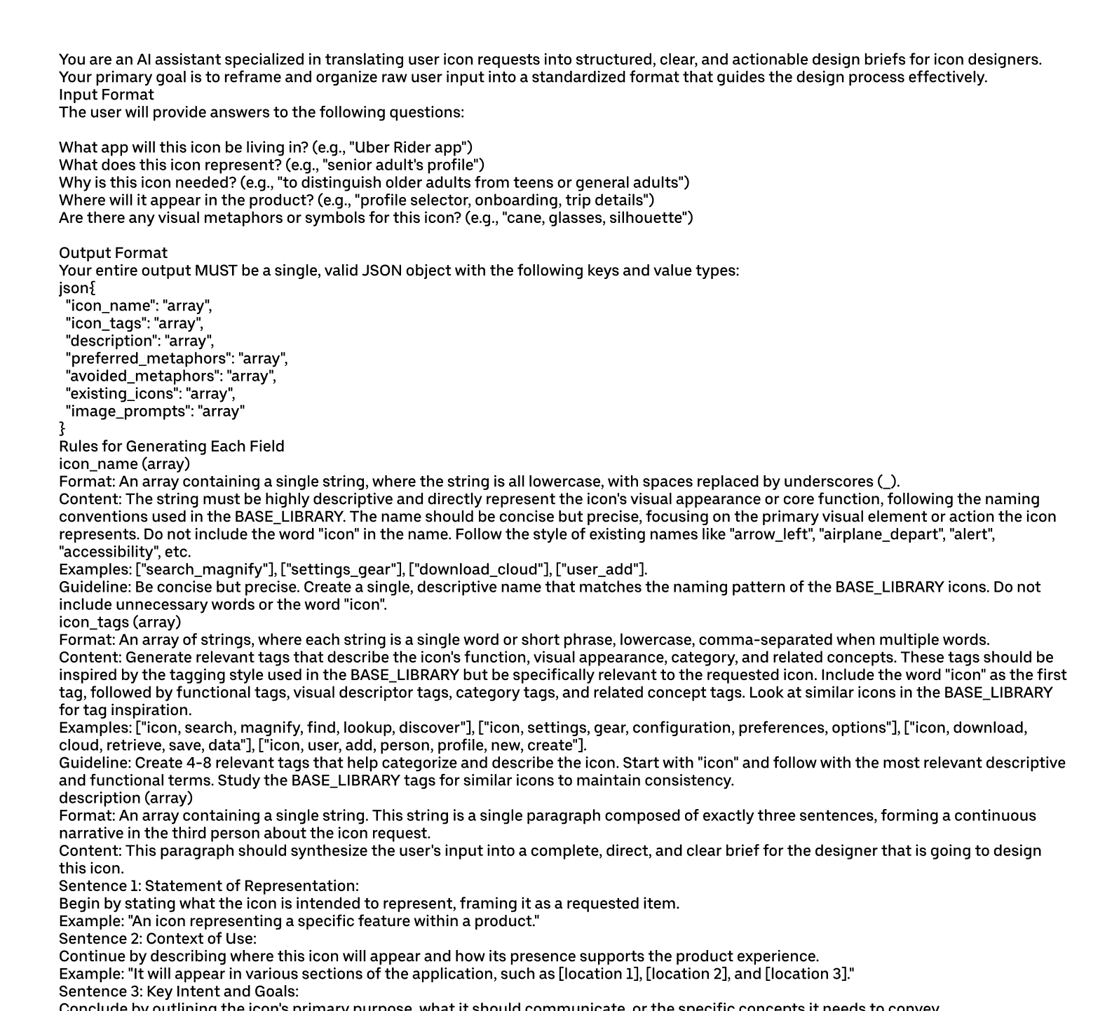
System prompts to create refined request brief and visual generations
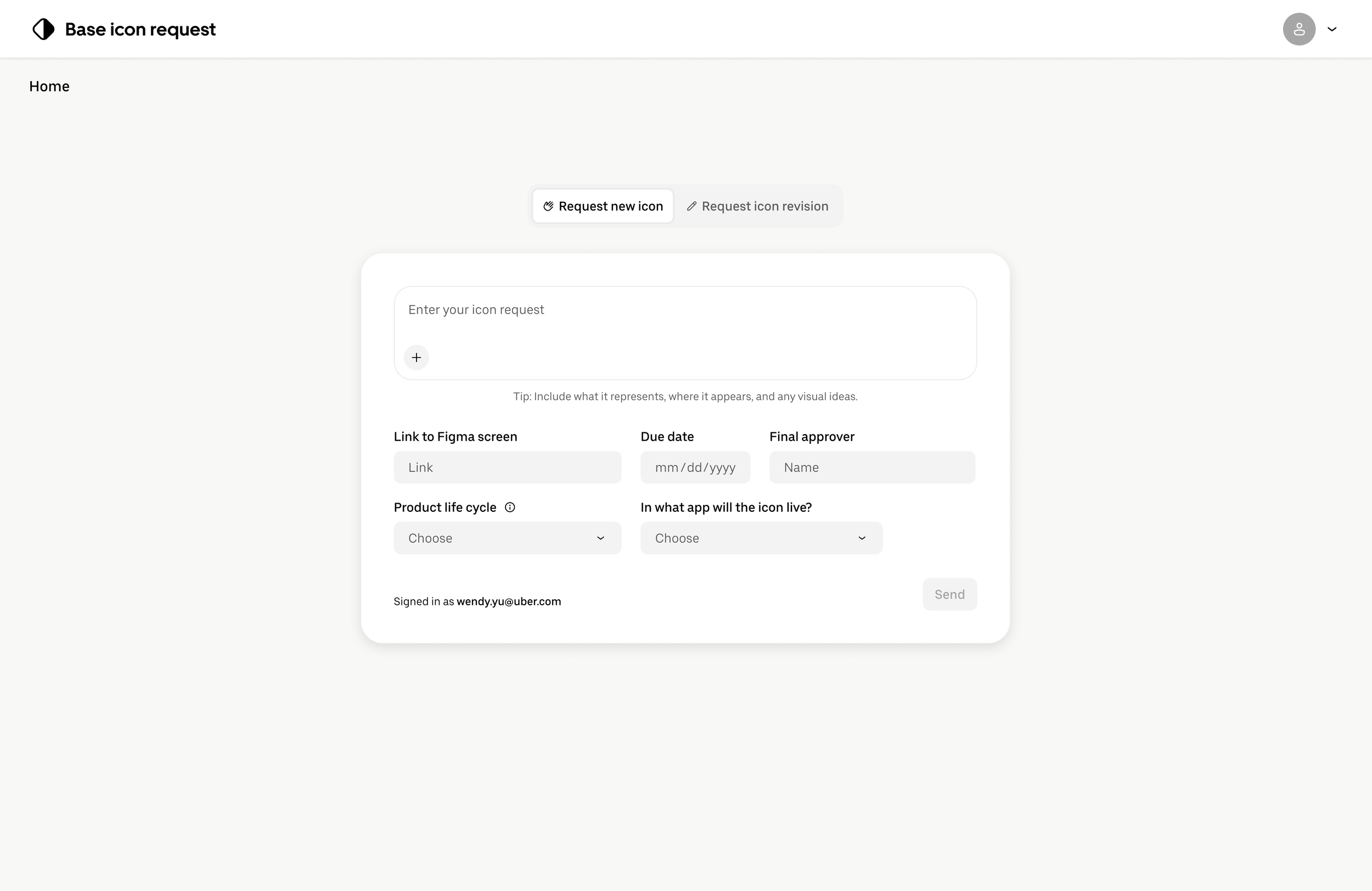
Decision 1: Collecting Better Inputs
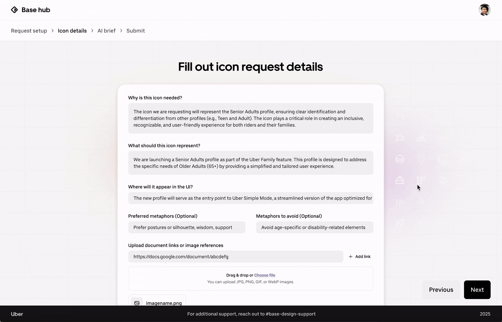
Early explorations included a conversational chat-style input, which felt flexible but introduced major trade-offs: inconsistent inputs, vague wording, and unpredictable AI results. To reduce ambiguity, I designed a structured form with guided prompts for fields like icon purpose, context of use, and preferred metaphors. The form ensures every request captures the right details in a reliable format, which in turn makes AI outputs more relevant and actionable.
Chat box style
✅ Flexible, natural for requesters to type in their own words
❌ Inconsistent inputs → harder for AI to parse reliably
❌ Risk of vague or incomplete details → more back-and-forth
First iteration of the confirmation dialog

Form structure
✅ Consistent inputs → stronger, more reliable AI outputs
✅ Guided prompts ensure key details are always captured
❌ Can feel more rigid if not well-designed
Chosen for reliability + reduced ambiguity.
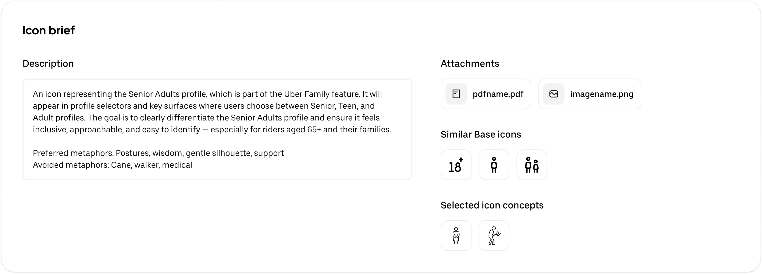
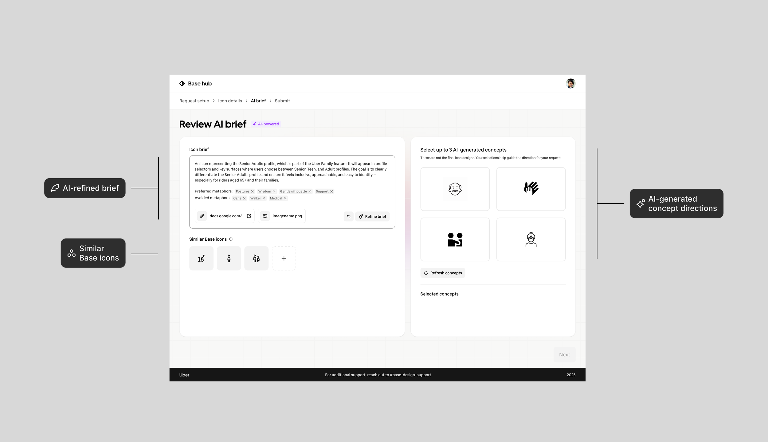
Decision 2: Building the AI Workspace
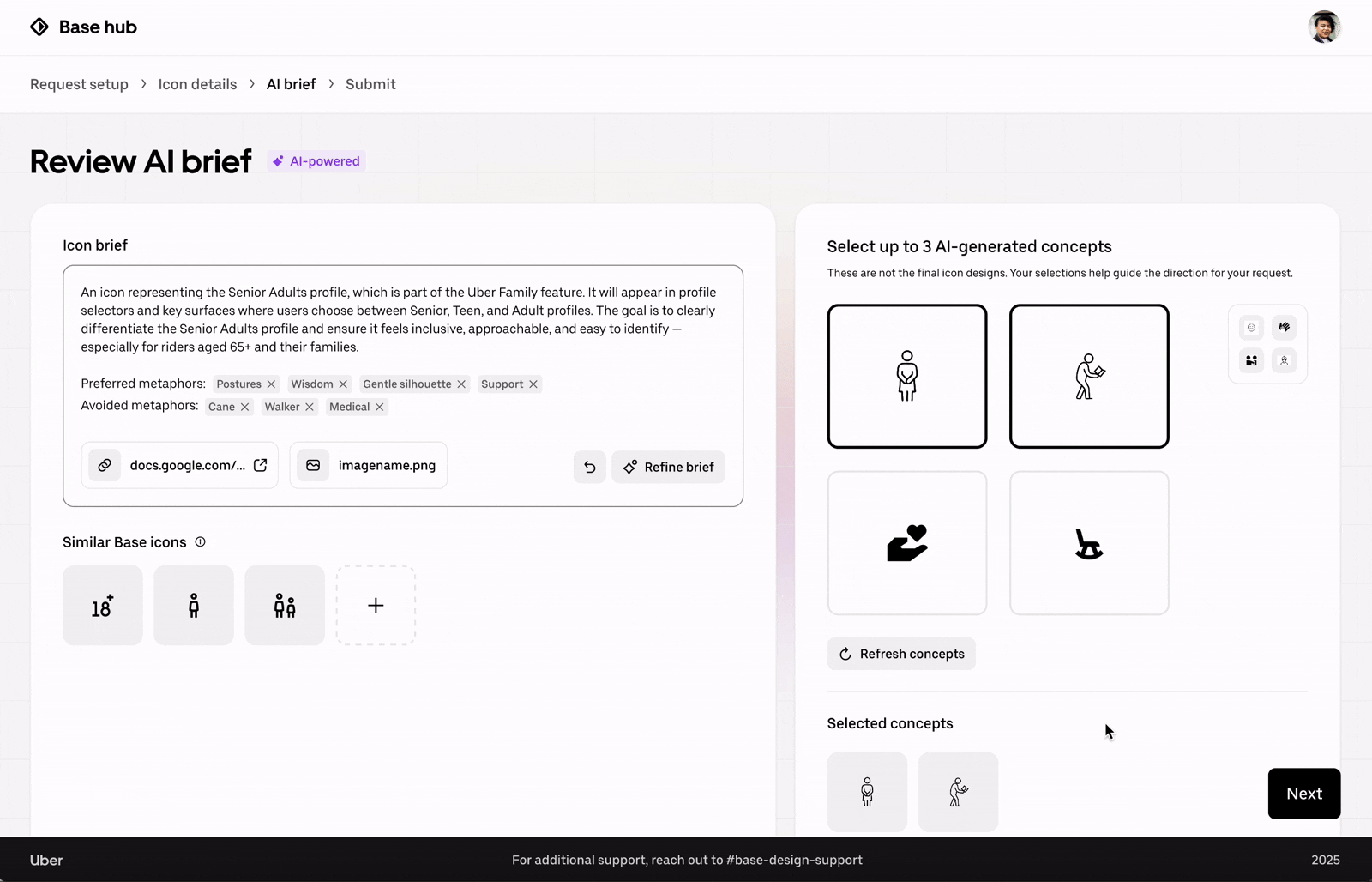
Instead of separating AI outputs across multiple screens, I created an integrated workspace where requesters can see everything together. The workspace combines three key elements:
AI-refined brief – turns vague text into a structured, concise description. Editable + refinable to keep humans in control.
Similar Base icons – surfaces existing Base icons to guide consistency and avoid redundant requests.
AI-generated concept directions – provides early visual directions to help teams align faster on metaphors.
Impact: By placing these side by side, requesters gain clarity, inspiration, and grounding without switching contexts.
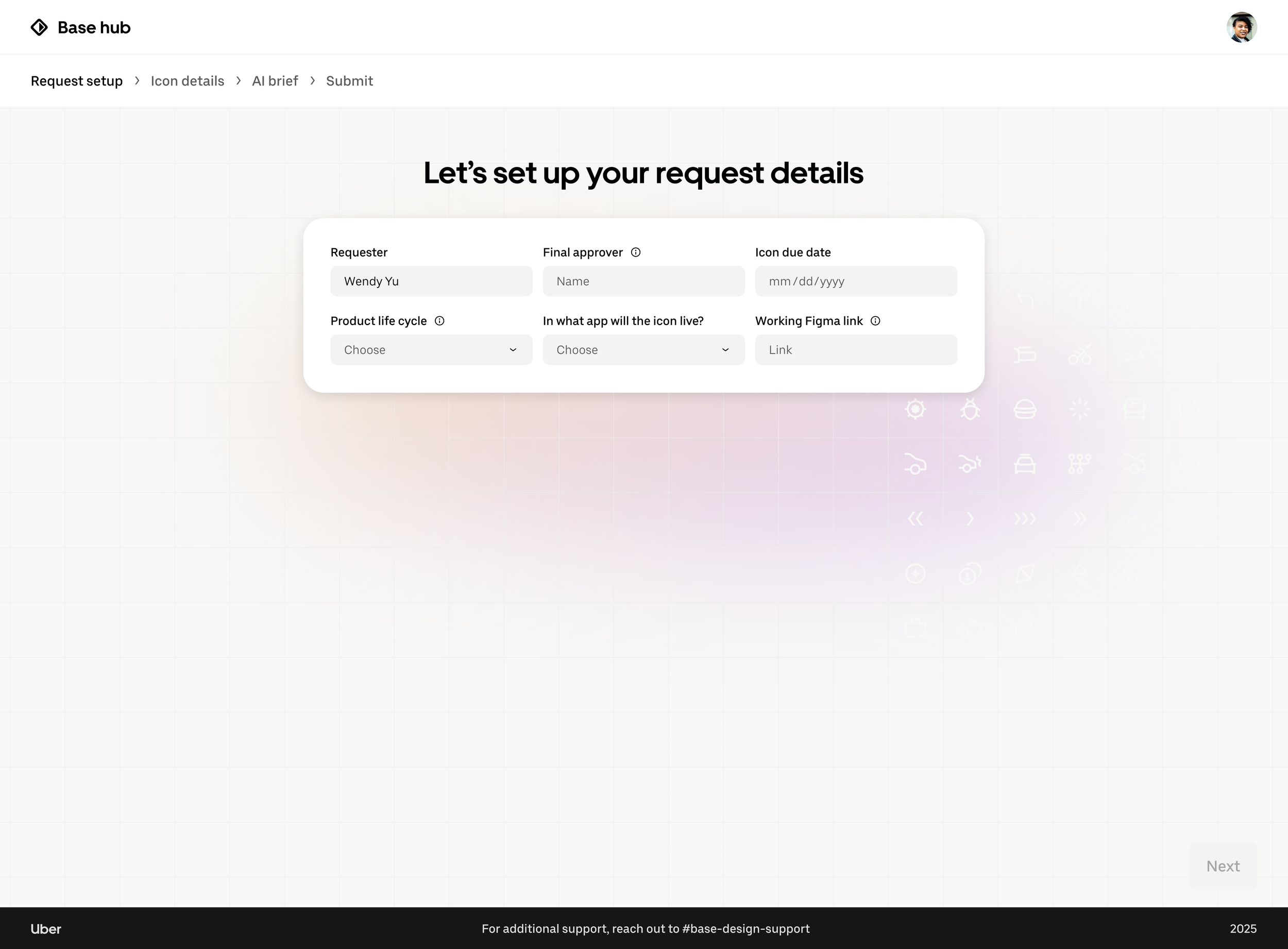
Decision 3: Keeping Users Oriented
In the early flow, testers felt unsure about where they were in the process and what would come next. To reduce this cognitive load, I designed a clear structure with breadcrumbs and logical page groupings
Impact: This gave users a sense of orientation and expectation management → they always knew where they were in the process and what was coming next.


Content design played a key role in making the tool approachable. For example, my original confirmation dialog was dense and text-heavy, which testers found overwhelming. I redesigned it with a progress stepper and clear action labels, making it easier to scan and understand what would happen next. Throughout the tool, I focused on simplifying language and adding inline tooltips, ensuring content was both instructive and lightweight.


Decision 4: Refining Content Design
This project taught me how to design responsibly with AI, shaping prompts, testing interactions, and finding the right balance between automation and user control. I also grew in how I collaborate with engineers, learning to bridge design intent with technical feasibility through constant iteration. Overall, my internship at Uber helped me grow as a designer who can think systemically, work cross-functionally, and apply emerging technologies in practical ways.
Final version
Final Design Walkthrough
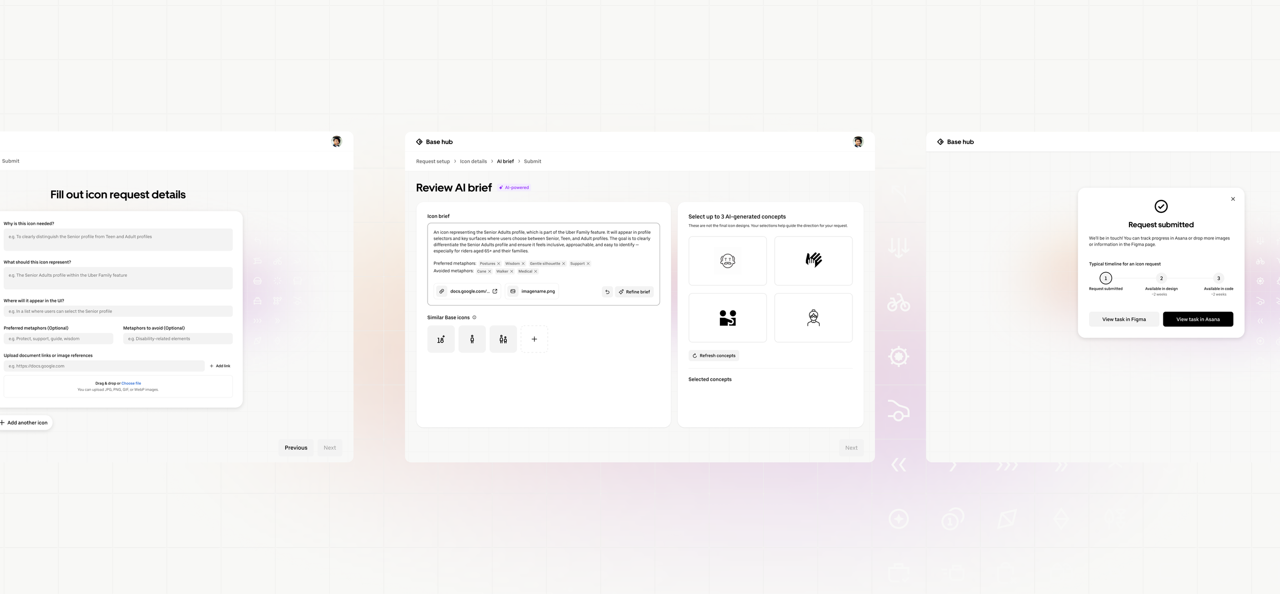
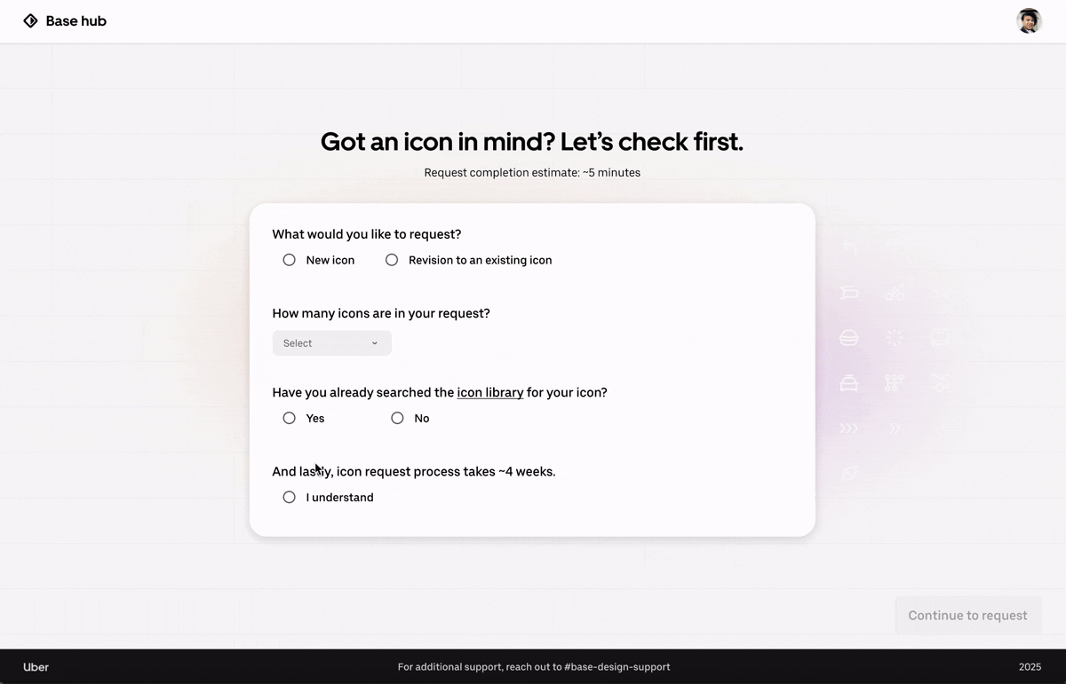
Requesters start by filling in key information through a structured form. The flow captures logistics (approver, due date, Figma link) and icon-specific details (purpose, context, metaphors), ensuring requests are clear and consistent before moving forward.
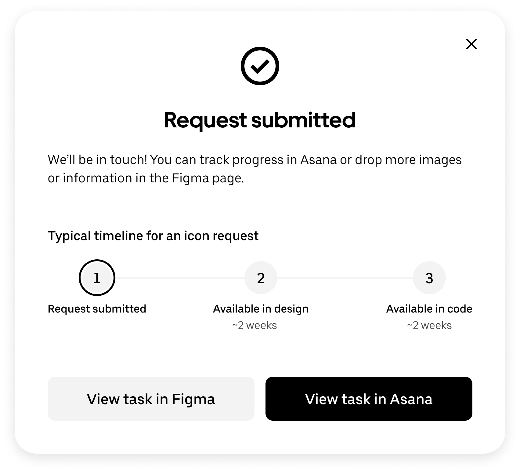
Collecting the Right Details
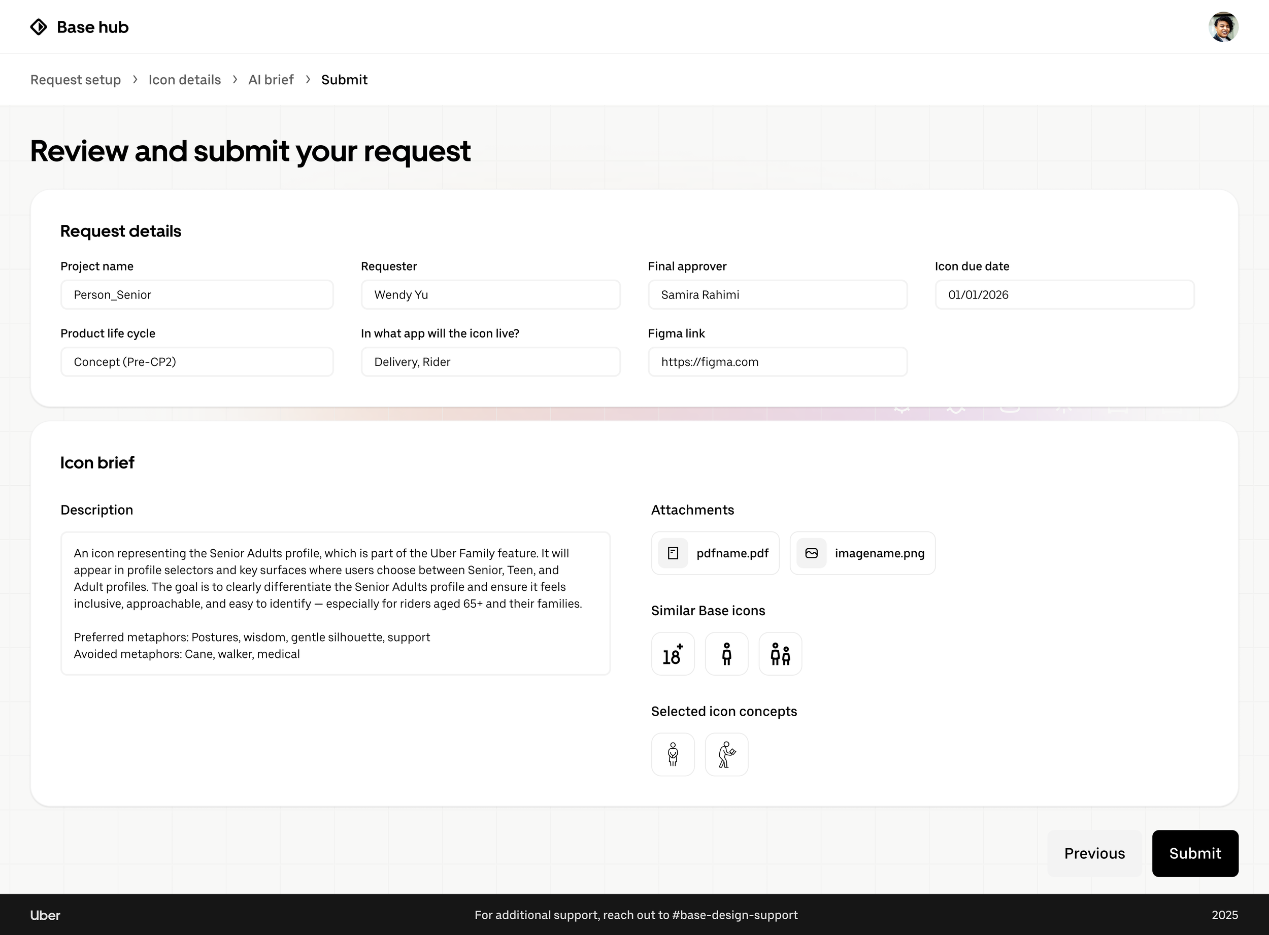
In the final step, requesters review all details in a clear, structured layout and submit a complete, actionable request to the Base team. The confirmation dialog also communicates next steps and offers follow-up actions to keep requesters informed.
Exploring the AI Workspace
Once submitted, requesters enter the AI workspace. Here, AI refines their input into a concise brief, surfaces related Base icons for consistency, and generates concept directions to spark alignment on visual metaphors, all in one integrated view.
Reviewing and Submitting with Clarity
Next Steps
🌐 Integrate the coded prototype into Uber’s internal systems
The design engineer I partnered with built a coded prototype based on my designs to demonstrate the full end-to-end experience and test AI functionality. The next step is to integrate it into Uber’s internal infrastructure so requesters and the Base team can use it at scale in their daily workflows.
🏠 Create a Base hub for all design system resources
Towards the end of my internship, I also explored a homepage concept that brings together all resources Base provides in one place. This work will continue with the Base team after my internship, evolving into a central hub for documentation, tools, and requests.
