
Bumble Events
A real-time social discovery feature that helps users connect with people who are already at the same event or venue. Whether you're at a music festival, networking event, or local meetup, Bumble Events allows you to check in, discover nearby attendees, and match with like-minded people in real life.
TIMELINE
4 weeks
TEAM
Independent
ROLE
Product Designer
FOCUS
Product Strategy
Mobile Design
Interaction Design
THE BRIEF
A proximity alert designed to drive premium conversion
The original brief I was given asked for a premium feature that would notify users when a potential match was within 0.5 kilometers. The assumption was simple: if users knew someone attractive or interesting was nearby, they would feel more motivated to engage, and potentially subscribe to unlock that information. But as I evaluated the concept, I saw three risks:
Privacy risk
Users may not want their exact proximity exposed.
Lack of context
“Someone is nearby” does not explain why connection should happen.
Passive interaction
The feature alerts users, but does not help them take the next step.
THE REFRAME
From proximity alerts to event-based connection
I reframed the prompt from “How might Bumble notify users when someone is nearby?” to “How might Bumble help people connect in places where they are already open to meeting others?”
That’s how Bumble Events came to life. I shifted the focus from notifications about proximity to real-time, event-based social discovery.
Before
Proximity Alert
“Someone is nearby.”
After
Bumble Events
“You’re both here for the same experience.”
RESEARCH
Understanding why proximity features struggled
Before designing Bumble Events, I looked at data from two previously sunsetted Bumble concepts: Proximity Alert and Map Integration for Nearby Events. Both features explored the idea of helping users connect based on physical closeness or shared locations, but neither sustained engagement after launch.


Data insights
Novelty fades quickly
Adoption dropped after launch, suggesting that location-based discovery needs more than initial curiosity to sustain use.
Proximity lacks context
Knowing someone is nearby does not explain why users should connect or how they should act on it.
Events create shared intent
Event-based discovery performed better, suggesting that people are more open to meeting when they already share a context.
Takeaway
A successful version of this feature should not simply reveal who is nearby. It should create a shared context, give users control over visibility, and help them take the next step toward meeting safely.
PRODUCT PRINCIPLES
Designing for safe, intentional real-world connection
Shared context first
Connections begin around a specific event, not just physical proximity.
User control
Users choose when to check in, whether to be visible, and when to meet.
Actionable coordination
The experience supports what happens after a match: finding each other, sending signals, and meeting safely.
Process
Mapping the end-to-end journey
I mapped the flow from event discovery to post-event interaction to make sure the experience supported both social discovery and user control.

Design decision: Aligning event discovery with Bumble’s swipe behavior
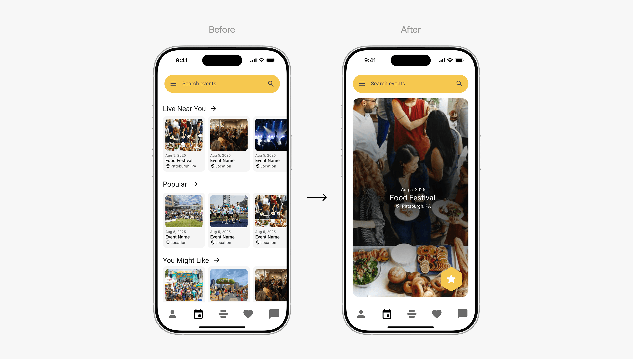
My early design used a carousel layout for browsing events. While it displayed multiple options at once, it introduced horizontal scrolling patterns that felt less native to Bumble. I replaced it with vertical, swipeable event cards to better align with Bumble’s existing interaction model and make event discovery feel more familiar.
System Design
Extending Bumble’s design language across platforms
To make Bumble Events feel native to the existing product, I built a small design system extension for the new feature. I adapted Material 3 components into Bumble’s visual language, defining the system across mobile, desktop, and Apple Watch.


FINAL WALKTHROUGH
Event discovery & check-in
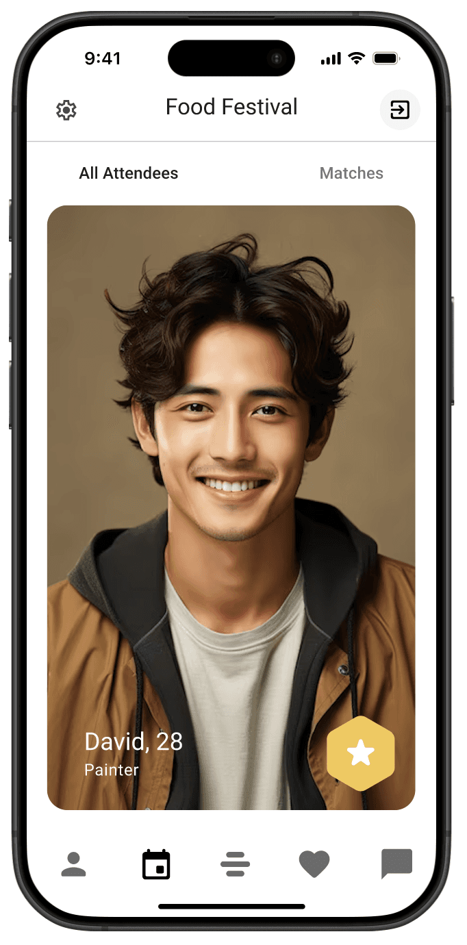
Users can discover events through swiping, similar to how they swipe on profiles. Users can tap into a card to view full event details and check in if they’re attending. There is privacy setting that allows users to choose if they want to share their specific locations with other participants in this event.

Match with people at the same event
Once checked in, users can see and swipe through others who are also at the event.
Coordinate a meetup
Meeting someone in a crowded venue can be difficult, especially without clear directions. Bumble Events makes it easier with a shared meeting point and real-time movement guidance.
"Meet Here" pin
After matching, users can drop a pin anywhere within the venue. Both users agree on the spot and receive directions.
Live status updates
Each user sees friendly updates like “David is 2 mins away” or “You’re almost there!” as they approach the meeting point.


Send a signal flare
The Signal Flare feature allows users to send a quick, friendly notification when they’re nearby
Watch

Desktop

REFLECTIONS
This project taught me the value of questioning the brief before designing the solution. What began as a proximity notification concept became a broader exploration of how Bumble could support real-world connection with more context, control, and safety.
The strongest design decision was shifting the experience from “someone is nearby” to “you’re both here for the same reason.” That reframing helped turn a potentially invasive alert into a more intentional social discovery flow.
I also deepened my understanding of design systems by adapting Material 3 components into Bumble’s visual language and interaction patterns across mobile, desktop, and Apple Watch.