

ScottyLabs Design System
ScottyLabs builds and maintains student-facing tools across Carnegie Mellon, including products for dining, courses, campus navigation, and community resources. As the organization grew, each product was designed by different student teams across different years, resulting in an ecosystem that felt useful but visually and structurally fragmented.
I led a team to create a design system to unify ScottyLabs’ product experience, strengthen its identity as an organization, and make it easier for future teams to design, build, and maintain new products with consistency.
TIMELINE
1 month
TEAM
Melissa Qin
Liyi Xu
Jodie Yang
ROLE
Design Lead
FOCUS
Design Systems
Interface Auditing
Component Architecture
Documentation
THE PROBLEM
A growing product ecosystem without a shared design foundation
ScottyLabs is a CMU student-run organization dedicated to building products that enhance campus life. It is responsible for a wide range of student-built products used across the CMU community.
But because these projects were created by different teams, at different times, with different design decisions, the overall experience lacked a shared foundation. Many of these products are widely used by students, but they often don’t feel connected to one another, or recognizable as part of ScottyLabs.


A snapshot of ScottyLabs’ product ecosystem, showing how different tools evolved with separate visual languages and structures.
Key challenges
Fragmented experiences
Different products used different layouts, components, typography, making the ScottyLabs ecosystem feel disconnected.
Repeated effort
Teams repeatedly redesigned common UI patterns from scratch, slowing down both design and development for new and existing products.
Weak product identity
ScottyLabs’ tools were useful, but they lacked a shared visual language that made them feel recognizable as part of one organization.
GOAL
Create a scalable design system that unifies ScottyLabs’ existing product ecosystem while helping future student teams design, build, and maintain new tools more efficiently.
PROCESS
Designing a system that could scale across different student-built products
ScottyLabs products vary widely in purpose, from course planning and campus navigation to dining information and event discovery. Because of this, the design system could not be a rigid template applied to every product in the same way.
Instead, I structured the system around a shared foundation and flexible extensions. Core styles and reusable components live in the ScottyLabs Core Library, while product-specific patterns can live in separate extension libraries. This allows the ecosystem to feel unified without forcing every product into the same interface model.

Design process
To avoid designing a system in isolation, we started by auditing existing ScottyLabs products and identifying the patterns teams were already using most often. We looked across both internal products and external design systems to understand which components should be standardized, which needed flexibility, and which were too product-specific to belong in the core library.
From there, we followed a repeatable workflow: audit existing use cases, design reusable component patterns, build them as configurable Figma components, and document in a single Figma file.


DESIGN LANGUAGE
Defining the foundation before building components
Before building the component library, we first defined the shared design language that would make ScottyLabs products feel more unified at the surface level.
Color
ScottyLabs’ color system was inspired by the organization’s existing logo. We started with primitive color scales for ScottyLabs’ core brand colors, then mapped them into semantic tokens for practical product use. Instead of asking teams to choose raw color values, the system defines roles such as background, foreground, border, status, making color decisions more consistent across interfaces.


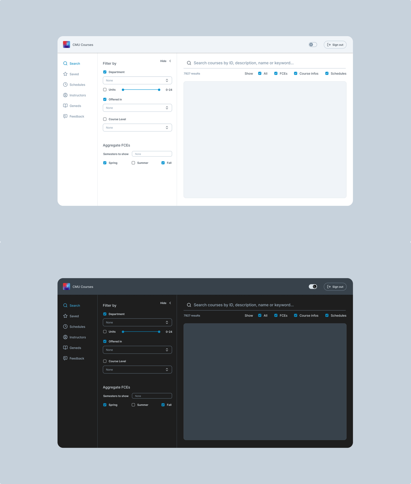
We built light and dark themes directly into the color system, using semantic variables so components could switch between themes with one click. To support accessibility, foreground and background pairings were defined to meet WCAG AA contrast standards.
Beyond functional UI states, we also introduced expressive color treatments for moments where ScottyLabs could feel more recognizable and playful. Gradients were used selectively for brand moments, call-to-action buttons, and visual highlights.


Typography
Typography needed to support a wide range of ScottyLabs products, from dense dashboards and course planning tools to more expressive landing pages. We defined a type scale organized by role: display, heading, body, and label, so teams could create clear hierarchy without inventing new styles for every product.

Icons
The icon system is based on Lucide Icons, an open-source set designed for clarity, consistency, and flexibility.

COMPONENTS
Core components
After defining the visual foundation, we built a core component library made up of the most reusable interface patterns across ScottyLabs products. Instead of trying to design every possible component upfront, we focused on the building blocks that appeared most often across existing projects: buttons, cards, checkboxes, dropdowns, search fields, switches, tags, and text fields.

The component configurations were shaped directly by the product audit. This allowed teams to adapt components from the properties panel without detaching them or creating one-off variants. Flexibility stayed built into the system, while spacing, typography, color tokens, and interaction states remained consistent across products.

The card component became a key example. One core pattern could adapt across multiple products while preserving a shared structure. This helped the system stay scalable: teams could design for their own product needs without breaking from the broader ScottyLabs language.

DOCUMENTATION
Documenting the system for long-term maintenance
We documented every core component in an organized Figma file, including each component’s purpose, anatomy, variants, states, usage examples, and configuration options. Because ScottyLabs is a student-run organization with rotating teams, documentation was essential to making the system sustainable. The goal was not just to create reusable components, but to help future designers understand, maintain, and extend the system with confidence.


NEXT STEPS
What's next
Build
Translate Figma components into reusable coded components with engineering.
Adopt
Apply the system to new products first, then gradually migrate existing products.
Guide
Expand usage guidelines, contribution rules, and examples for future teams.
Evolve
Add new components based on real product needs and recurring patterns.
REFLECTIONS
Building the ScottyLabs Design System deepened my understanding of what a design system needs to do beyond visual unification. The challenge was not simply making products look more consistent, but creating a foundation that future student teams could understand, maintain, and extend.
This project pushed me to think more systematically about component architecture, design tokens, documentation, and long-term scalability. I also became much more confident with advanced Figma workflows, including variants, component properties, semantic variables, and light/dark theming.
Most importantly, I learned that a strong design system is not meant to control every design decision. It should give teams enough structure to move faster and enough flexibility to solve the specific needs of their product!